How to Optimize Images Without Losing Quality
Displaying your best work as a photographer online without sacrificing quality is a delicate balancing act. Of course, you want to (and should) show off your most spectacular work employing complex compositions and an array of colors, but this is bad for your page speed…very bad.
As a professional photographer, it is crucial to display your work in it’s highest quality to your website visitors. Your website is your business card and your only chance to make a first impression on your potential clients. The Nielson Norman Group found in 2011 that users leave web pages in 10–20 seconds, unless you clearly communicate your value proposition within 10 seconds. In 2019 The Daily Egg found that 15 seconds or less is the amount of time that you have to generate interest.
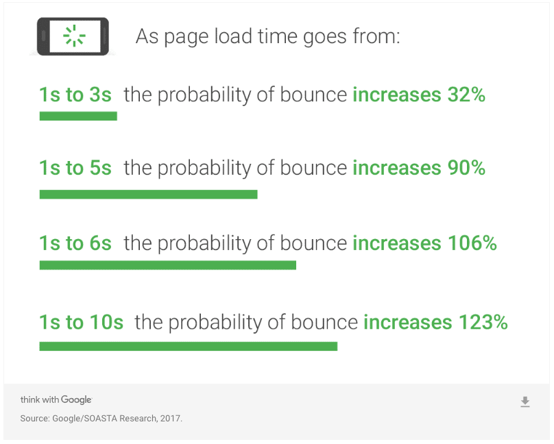
Probability of losing a visitor due to slow loading time according to Google/SOASTA Research 2017:
- 1 second to 3 seconds – The probability of your visitor leaving increases by 32%
- 1 second to 5 seconds – The probability of your visitor leaving increases by 90%
- 1 second to 6 seconds – The probability of your visitor leaving increases by 106%
- 1 second to 10 seconds – The probability of your visitor leaving increases by 123%
For WordPress users, there are plugins out there that claim to do this for you, but they don’t work. At least not well. Take wpmudev’s popular plugin Smush and WP Smush Pro for example; sure they might work if you’re okay with lossy compression (where you lose quality to gain speed) and don’t mind paying a premium monthly subscription for their service, but for professional photographers, the savings from lossless compression via Smush is simply not enough.

Additionally, if you are using a WordPress website your website speed is often affected by the number of plugins enabled since it requires browsers like Google, Yahoo, and Bing to process more and more code to power the plugins handling these tasks. The general rule of thumb is to utilize as few as possible plugins on your WordPress site.
By manually resizing and compressing your images you have more control of the quality of images you display, and you are actually reducing the file size, not creating more work for the browser to process (which is how WP Smush and Smush Pro handles resizing.)
You may be wondering how to find out how quickly (or slowly) your site loads, or what (if any) images are in need of being resized in order to speed up your load time. We like to use several tools, and compare results since not all tools return the same results, it is best to cross-reference.
Some of our favorites are:
These sites will return a list of all of their recommendations on how to speed up your site including a list of all images that could be resized and compressed. You will even receive the link to the image directly in order to easily find what images you need to work with.
So how do you optimize your photography portfolio to play nice with search engines like Google without sacrificing quality?
The short answer is you cannot… at least not completely. You will need to resize your images and reduce their file sizes. We are going to show you how to do that and keep your images as close to their original quality as possible.
- Properly resize your images
- Optimize your images
- Test your website speed
 How to properly resize your images for faster loading time
 How to properly resize your images for faster loading time
If you are a professional photographer, your images will be captured in an insanely high resolution. These files are so detailed and contain so much information that they can be blown up into lifesized proportions and retain their quality. Not only does uploading full resolution or print resolution images (300 dpi or ppi) to your website slow it down, but it is overkill, as that much information isn’t even needed to produce an image to fill the screen.
Most responsive websites (those that scale up and down depending on the size of the viewport) can display a full-screen desktop image at 1920 x 1100 pixels and retina displays are around 1080 pixels wide to display beautifully.
The first step you will need to take is to reduce the resolution of your images.
Open your image in Photoshop or your favorite photo editing software and reduce the resolution to 72 which is the resolution of websites on desktop and mobile devices. Make sure that you do not “resample” the image as it could result in an image that is far too small to use. Remember we want our images to be able to fill up an entire screen.
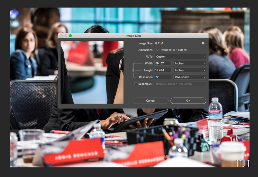
You can resample the images if you want to and input the specific width and height. Click on the chain icon to unlink them to set width and height independently of one another. This is not advised since it could result in weird cropping of your image. It is best to reduce resolution, then position your image into the size you want it to be displayed in and “Save for Web.”
Once you have reduced the resolution from print or raw quality to web quality “72 pixels per inch” you will want to find out exactly what size the images need to be for your website. This can take some time, but it is well worth the process in blazing fast speed you will gain.
There are several ways to determine what size your images should be, if you run your site through one of these tools we suggested, or use a plugin that tells you when you have images that are too large, all that you have to do is go through the list and resize to the suggested size.
Alternatively, you can view the source and inspect the image to see what the intrinsic (original) size is versus the actual displayed size. Just keep in mind that whatever size you are using for full-screen images needs to be increased for retina displays by about double the pixels per inch. For example, if you have an image that is displayed at 300 pixels on your desktop site, you will want it to be 600 for retina devices.
 Remove EXIF data
 Remove EXIF data
Your image will be much smaller, but what if it could get even smaller and still look great? Removing the EXIF data can be done using software such as the ones below. We like to use ImageOptim because you can compress your images using lossy compression with a sliding scale of quality. If you went too far, there is an option to “revert to the original.”
Because you are a professional photographer, it is important that you are able to keep your copyright information and watermark so it is a good idea to run them through Lightroom or enter the metadata section in Photoshop to implement these items before compressing them.
Enable Lazy Loading
Lazy loading is the term for delaying the download and display of images below the fold of your site or just outside of the initial viewport. This can be achieved a number of ways, but here is a great article on how to implement lazy loading on any website: Native lazy load.
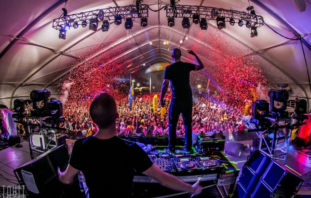
Concert Photography Crush Arizona Rawhide 2015
Test the speed of your website
Once you have resized your images for search engines (search engine optimization or SEO) test your website at one of these amazing free tools:


